Shay Ruggles
Head of UX/UI
As Director of UX of Gravity Shay Ruggles ensures Gravity is creating compelling user experiences that balance user intent, client goals and site performance.
In a world of providing critical needs and fighting for donation dollars, all on a shoestring budget, non-profits need to project clarity and focus more than the average website. Getting there isn’t always easy. But having an outside agency look at your offering and website with fresh eyes is a great start.
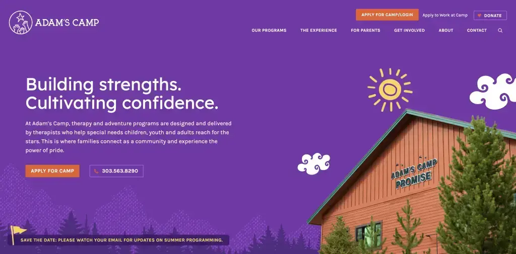
While Gravity has deep expertise in B2B and B2C clients, you may not know we also have a long history of working with non-profits. That’s why we were thrilled when we were given the opportunity to work with Adam’s Camp, a non-profit therapy and adventure camp designed to help special needs children, youth and adults, and delivered by trained therapists.
Having worked with several non-profits, we wanted to share our perspective on what goes into making a great non-profit website.
Non-profits are always being pulled in different directions. But prioritizing your audiences is key to making sure your website doesn’t end up being more confusing than helpful.
Once you've identified your primary audience, you can start prioritizing the information architecture and overall experience to cater to their needs. Secondary audiences typically have a similar set of needs, and sections of content can be created to accommodate them without sacrificing the clarity and calls to action of the primary audience.
Yes, donations are critical. But donors are generally motivated audiences and if you maintain a clear donation button on your site, that should usually get them where they need to go. Getting your primary target audience the content they need should be priority number one.
Clearly outlining your mission is content that should be either in your banner area or just below the banner, but it should be clearly listed on the homepage and on your About section. It should be 100% obvious what your mission is and the services you provide.
Interview customers if you can. In the case of Adam’s Camp, we were able to draw on the experience of their program staff and I was able to draw on my years of experience working the front-line phones for a non-profit adventure camp in my past.
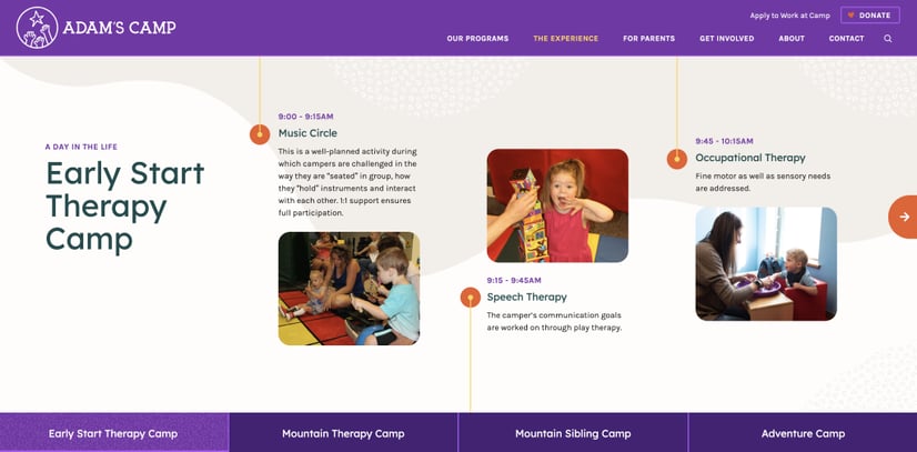
For Adam’s Camp, we were able to identify key content that was missing and get that clearly articulated in their global navigation. This included creating an engaging content section for campers to get excited about programming and a new section just for parents, outlining critical program details and how to pay for camp.
Loud and proud calls to action are more important than ever when it comes to non-profit websites. This is not the time for a “soft sell” – it’s the time for the inflatable wacky dancer.
Even if you want to get donations, your target audience’s call to action should be primary. If you don’t have a primary call to action outside of collecting donations, you’re in luck, your donate button should be loud and proud.
Example primary calls to action (besides donate):
Pin your global navigation so it’s omnipresent in the upper right-hand corner of your desktop design. On mobile, have it outside AND inside your hamburger menu so it’s always present.
Ensure your banners and your final piece of content per page is inviting visitors to your calls to action specific to that page.
For Adam’s Camp, we created a section dedicated to how you can get involved with the camp, assuming you were not attending camp. We outlined the ways you can donate, raise money, work and volunteer for Adam’s Camp. Grouping these together showed visitors the breadth of ways they can engage with the organization. Even if they were just looking to donate, they might know someone that was interested in working in volunteering. If these were in different sections, they might not get that visibility.
Non-profit websites are a time to pull on those heartstrings. Whether you’re looking to provide comfort, inspire action or provide a critical service – now is the time to inspire through design.
Feature high-quality photography of your actual programming. Know someone with a high-quality camera or can you get a photographer to work an event pro-bono? It will be worth it to bring your non-profit to life in a way that stock photography never can.
Want to inspire? Be bold! Now is the time to take a bold stance on who you are and take a heavy hand with your branding.
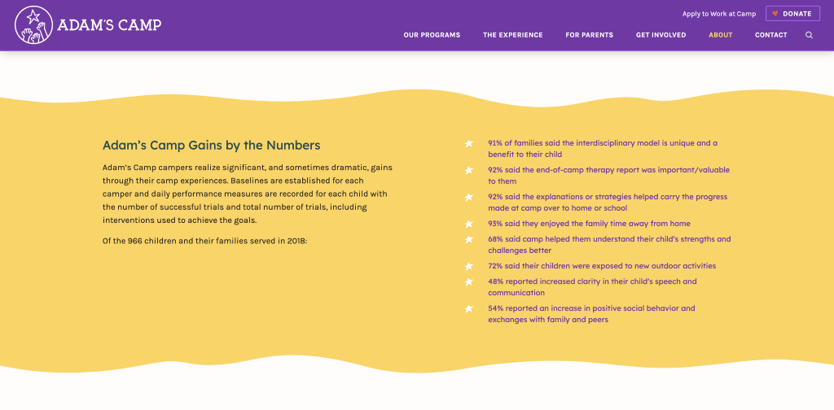
Facts and stats are an amazing way to showcase the efficacy and value of your non-profit. Work hard to get success stats, testimonials and proof points. They’re easy to scan and pack a powerful punch. Don’t skimp on the business side either. The best way to validate your need for donations is to prove their value through hard facts.
While we still follow our proven website process for non-profit organizations, the need for clarity and focus is more important than ever. Non-profit websites benefit from bold, vibrant design and photography that can bring their mission and vision to life.
While we loved creating a bold new brand for Adam’s Camp, we're most proud of how the website truly captures the spirit of their organization and helps parents and caregivers get their loved ones involved in one of these amazing programs.
If you have a non-profit website that could use some love, we’d love to learn more about your amazing work and see how we can transform your online experience.